- Strategy: Brand Strategy, Brand Plataform, Naming. Design: Visual identity, Logotype and Illustration.
- Client: Mogu Izakaya Bar-restaurant.
- Partners: Gustavo Ruchaud e Guilherme Ruchaud.
2021
Mogu
"For those who like Izakaya."
We want even more people to look for Izakayas knowing what to expect from the idea. In our space, each person takes a beverage and a snack - both Japanese-inspired - to disconnect from the outside world. It is believed that nothing is immutable, so we test a lot in the kitchen and we seek to be connected with those found in food, unusual experiences, amazing or simply unique.
The Challenge:
to create a daily haven. The project's challenge was to establish a physical space and visual identity that could effectively convey a sense of warmth and hospitality to the public—a daily haven. Mogu serves not only as an izakaya but also as a hiding place where people can relief after a stressful day.
to create a daily haven. The project's challenge was to establish a physical space and visual identity that could effectively convey a sense of warmth and hospitality to the public—a daily haven. Mogu serves not only as an izakaya but also as a hiding place where people can relief after a stressful day.


The Solution:
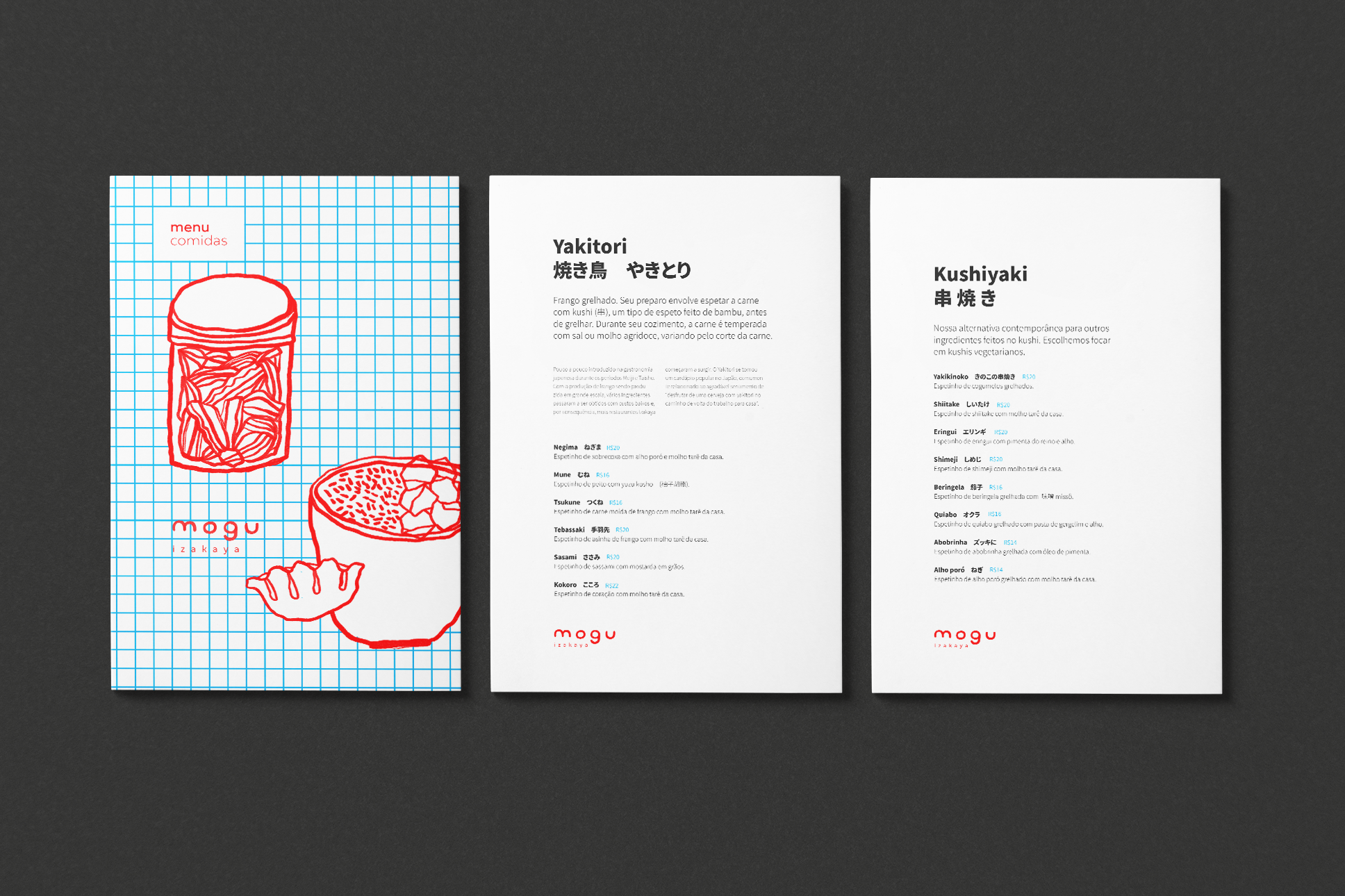
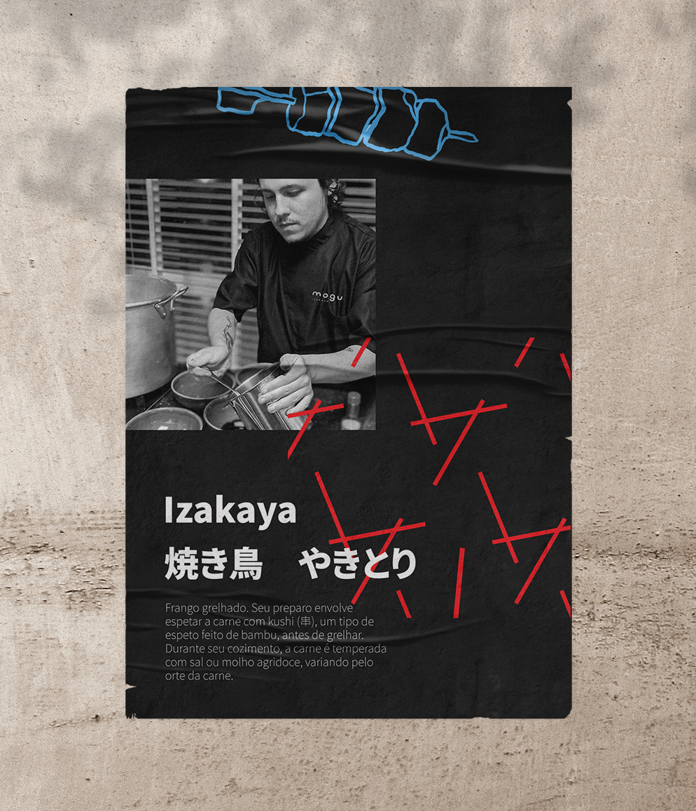
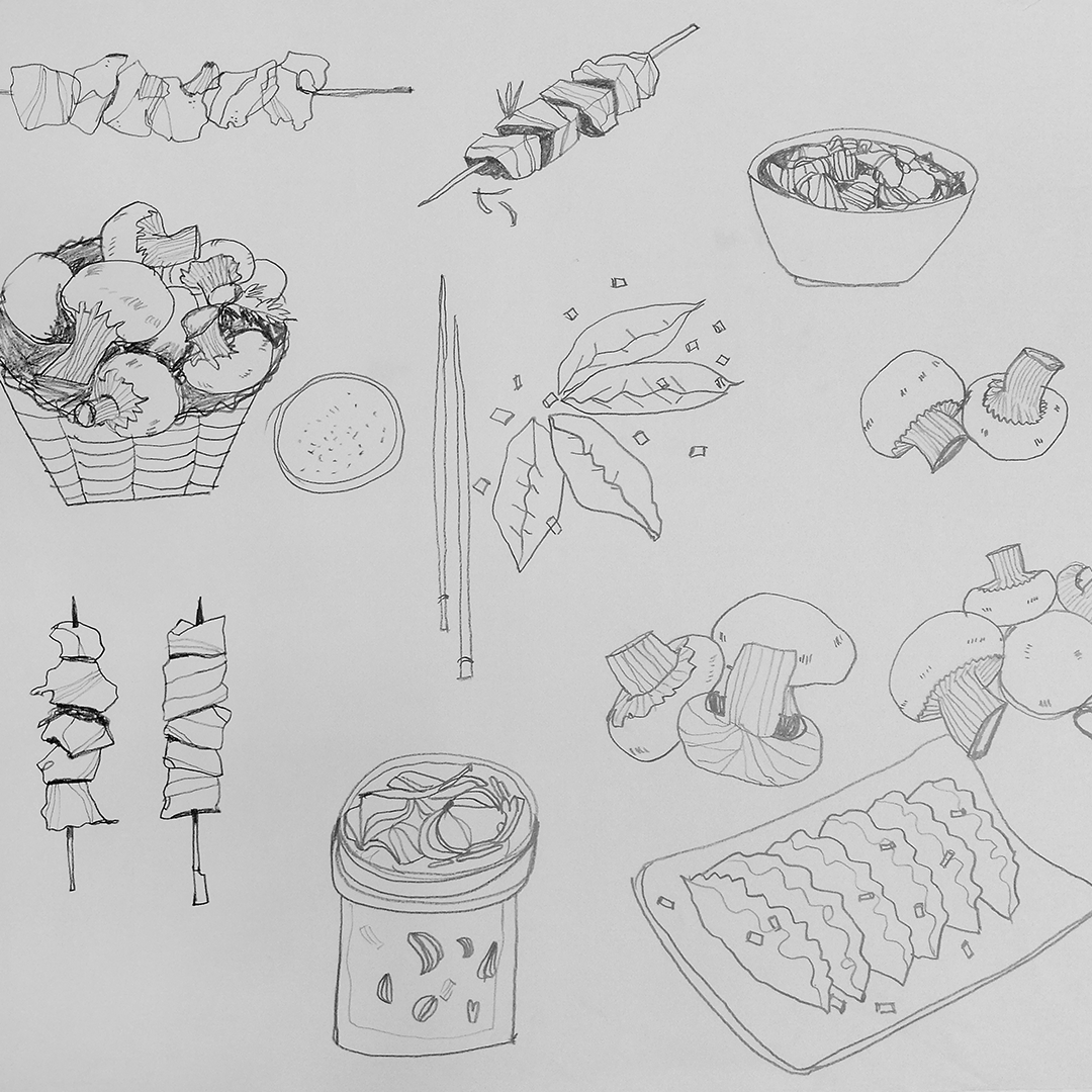
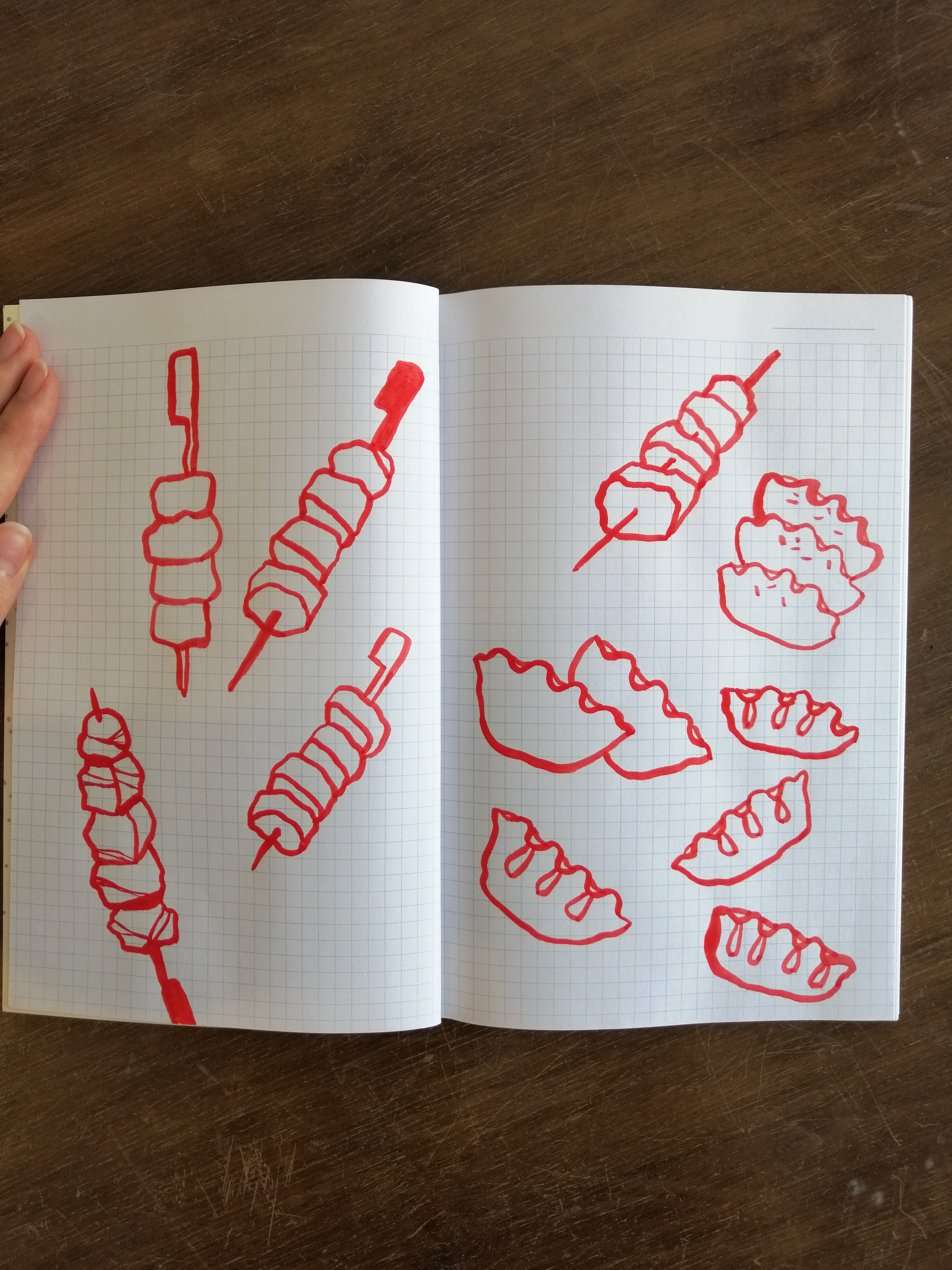
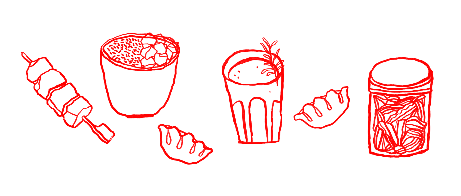
Experimentation holds a central position for the creators of Mogu. They believe that nothing is fixed or unchangeable. In the kitchen, extensive testing occurs to bring forth unusual, surprising, and uniquely crafted culinary experiences. The visual identity of Mogu follows the same principle, embracing an experimental and distinctive approach. Starting with pencil sketches and later rendered with gouache ink on a lined notebook, the Mogu aesthetic is born.
Experimentation holds a central position for the creators of Mogu. They believe that nothing is fixed or unchangeable. In the kitchen, extensive testing occurs to bring forth unusual, surprising, and uniquely crafted culinary experiences. The visual identity of Mogu follows the same principle, embracing an experimental and distinctive approach. Starting with pencil sketches and later rendered with gouache ink on a lined notebook, the Mogu aesthetic is born.
The irregularity of the lines symbolizes the fluidity of the kitchen and how the dishes are conceived. Furthermore, it emphasizes the notions of warmth and welcome, which are integral to the overall experience.
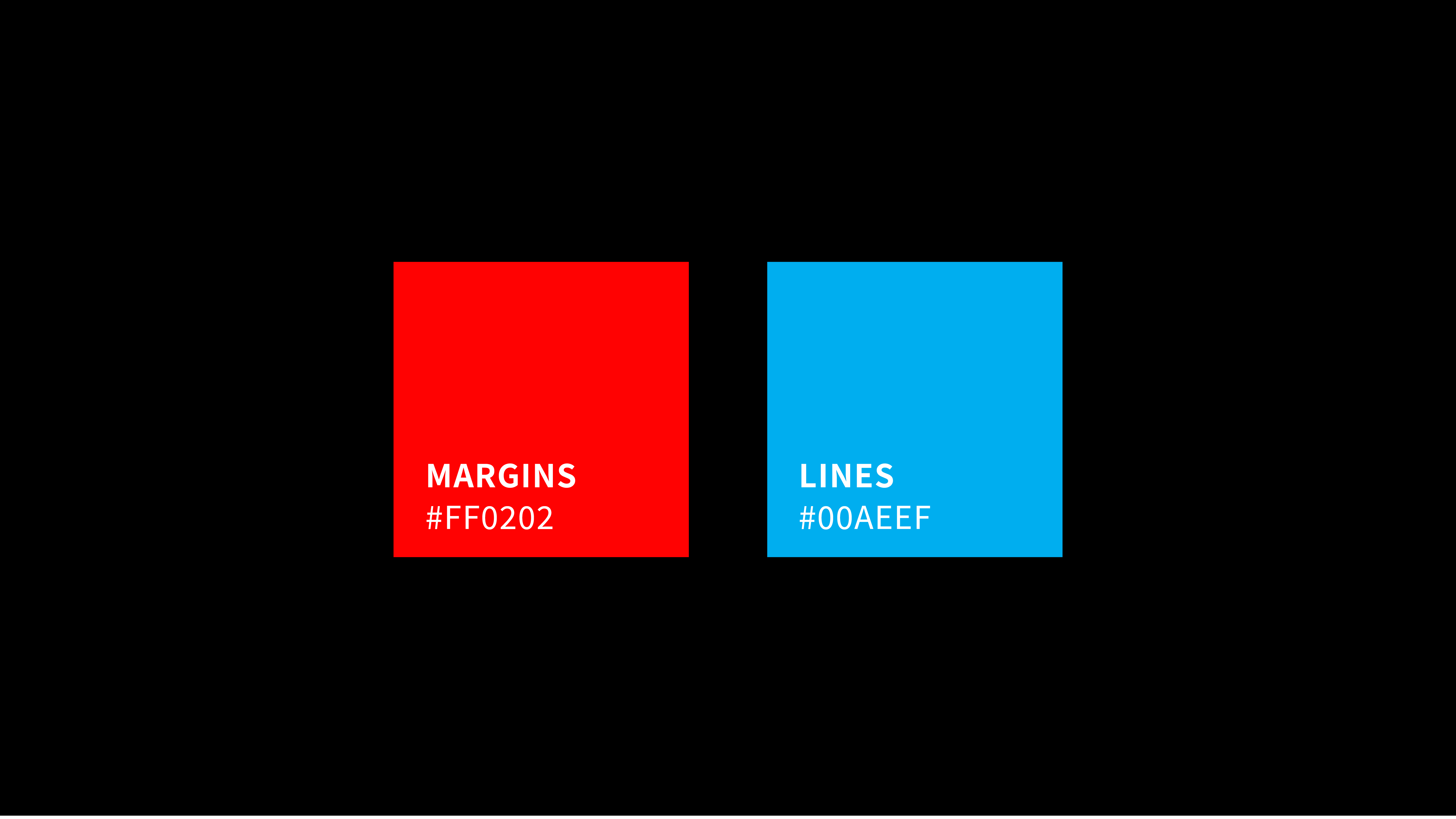
The two main colors of the Mogu identity, red and light blue, originate from the lined notebook - the margins and the lines.